
VaxFacts
A public health resource that provides reliable health news and testing info.
Roles: UX researcher and UX designer
Timeframe: June – July 2022
Context: Concept created with a two-person team for City University of New York (CUNY) UX Certificate
COVID-19 isn’t just a health crisis. It’s also an information crisis.
Amid the depths of the pandemic, reliable public health information became more important than ever.
Misinformation rose to "infodemic" levels, according to the World Health Organization – which had direct consequences for peoples' lives by contributing to lower rates of vaccination.
“During the COVID-19 pandemic, health misinformation has sowed confusion… While health misinformation has always been a problem, today it spreads at unprecedented speed and scale.”
U.S. Surgeon General, 2021
As a response, VaxFacts helps people take charge of their health news to stay informed and safe.
We identified target audiences to keep front-of-mind as we began researching and designing:
People who participate in public health efforts, such as vaccination and COVID-19 testing
Health-conscious people trying to keep up with news about COVID-19 and other public health issues

Our target users want local testing info and reliable news in one place.
We kicked off our research process by talking to potential users. We conducted user interviews with 6 people who matched our target audiences and represented a diverse range of age and backgrounds, to better understand how VaxFacts could benefit them.
What we learned
Our user interviewees reported that:
Being closer to home and short wait times were the most important factors when seeking out vaccine appointments and tests.
Health care providers are the most trusted sources of vaccine and testing information. They do their own health research – typically with search engines – but verify everything with their doctor.
Pain points include compiling and verifying research for disparate sources, without one essential bank of information.
“For COVID-19 testing, the closer to home the better.”
“I’d like an essential source of information on vaccines and testing. It should be reliable and updated regularly.”
“I do my research, then I talk to my doctor.”

Meet Mel
We developed a user persona, Mel, that reflects the findings from our user interviews. Throughout our ideation process we referred to our persona to ensure all design decisions spoke to real user needs.
-
Mel commutes to work and lives with their children, so the health and safety of others is often on their mind. They visit their doctor and their local pharmacist regularly. They seek their doctor’s advice before making vaccination decisions, but they also do their own health research online and by reading the news to feel up-to-date and informed. They have limited free time so they schedule health appointments at locations near work or home for convenience.
-
• Doctor’s and pharmacist’s opinions and advice
• Health related websites
• Scientific studies
• News articles and TV segments
• Family and friends
-
• Have vaccine info and news at their fingertips for their personal research
• See all COVID-19 testing location options in one place
• Contact doctor or pharmacist with questions and concerns
-
• Convenience
• Staying healthy
• Staying informed about personal and public health
• Doing their part to support the health of their family and the people around them
-
• Collecting info from various sources on the testing locations that they have access to
• Not knowing which COVID testing locations have short waits before arriving
• Missing out on vaccine information such as booster incentive payments
• Not knowing what reactions they might have from a vaccine
Would I Do It Differently Next Time?
Short answer: yes.
Mel’s user persona gave my teammate and I a shared language and set of goals during our ideation process and when critiquing each other’s work.
But on further reflection, the persona represents a very specific type of person: someone who is likely already a skilled media consumer and who will put in the effort to find reliable information even if VaxFacts doesn’t exist. To truly combat misinformation, VaxFacts would need to reach people who are equally as busy and concerned about their health as Mel, but who is less trusting of medical professionals and mainstream media.
If I were to do it again, I’d reframe our target audiences with that in mind, which would result in a different user testing plan and ultimately a different type of persona.
Ideation, Design, and Testing
How Might We Make It Easier for Mel to Stay Safe with Vaccine and Testing Info?
We kicked off our design process by asking ourselves: how might we make it easier for Mel to stay safe with vaccine and testing info?
We each brainstormed answers to this question, then grouped related ideas. We used dot voting to identify the ones we wanted to explore further.

Snapshot of our brainstorm map. View the map in full here.
Sketches and screens


I’m a big fan of the Crazy 8s method of sketching eight responses to a prompt in eight minutes. I love how it forces the boring ideas out rapidly and drives me towards fresh design solutions.
We ran several Crazy 8s sessions to respond to each of our favorite “how might we” ideas. From there, we honed our sketches and developed low-fidelity screen mockups.
Before translating our designs into hi-fidelity mockups, we conducted usability testing to confirm whether the information architecture, iconography, and other elements of the interface were intuitive to users.
Usability testing
Our testing approach:
We recruited five usability testers spanning ages of 26 to 60 years old
We gave testers four tasks to complete in a lo-fidelity Figma prototype of our app
We also asked open-ended questions about how and whether the app meets their needs
Overall, the app met tester’s needs and expectations.
4 out of 5 usability testers responded "yes" to the question, "Does this app meet your personal health needs?"
19 of 20 tasks were successfully completed by testers.
On a scale of 1 (hardest to navigate) to 5 (easiest to navigate), the app was rated a 4 on average
However, there were some hiccups.
Usability testing revealed that some features and flows were confusing to users

Usability testers also reported that a page with links to health news websites felt unexpected and unnecessary.
“I would Google these sites.”
Usability testers reported that a word cloud of trending health news topics was confusing and "anxiety inducing."

“This wasn’t intuitive to me, as an old-folk.”
Design Solutions
Curating Mel’s go-to health resource
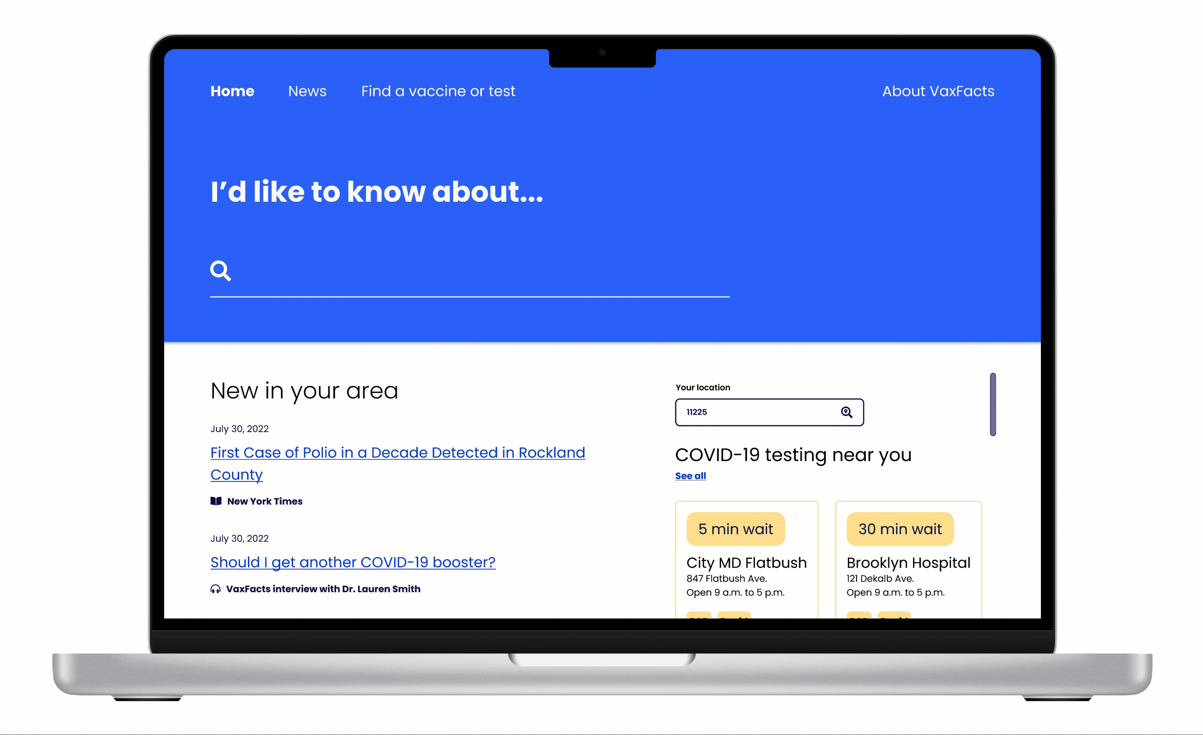
We know from our user research that Mel wants one essential source for health information, and that they trust information from healthcare providers the most.
VaxFacts provides curated and original articles from reliable news sources, including physicians and other healthcare professionals. Mel can browse all news or search specific health topics for related articles.

Designing for desktop
People 65 or older face disproportionately high risk of hospitalization and death from COVID-19, so it's crucial for VaxFacts to be accessible to seniors.
Because only 61% of seniors own a smartphone, we pivoted from our mobile app focus and ultimately designed VaxFacts as a browser app with a desktop-first mentality.

Making Mel's test and vaccine searches easier
On the Find a vaccine or test page, Mel can choose the most convenient test or vaccine option based on wait time, location, and other relevant details.
Our interface prioritizes the information we know Mel will be looking for first: wait time and distance from Mel's current location.
As our public health needs evolve, this interface can scale to include information on several different types of tests and vaccines, from flu to COVID-19 booster shots and more.
Reflection
This project showed me that I can get scrappy.
Without a budget for research, I needed creative solutions to reach a diverse and representative participant base for my Vax Facts research. I put out asks on platforms such as Reddit and to my professional and social networks to find interviewees (prioritizing people who I didn’t know personally). Through this process I learned how to write a persuasive request for participation and how to come up with non-monetary rewards for participation, such as skills barters.
Even a two-person team needs a project manager.
I quickly identified that our small team needed formal project management to meet our tight deadlines achieve our ambitious research and deliverable goals. I took on tasks including managing tasks in Notion, setting meeting agendas and delivering follow-up notes, and running short routine stand-ups with my teammate.
Design can’t solve everything alone.
The success of Vax Facts would hinge on the accuracy and timeliness of the news content – and the public’s willingness to rely on media outlets for health information. As such, designers must consider how they can both guide and support social change. Questions I might ask at future steps of this site development would include: How can this experience be more welcoming to people with minimal media consumption experience? What innovations are happening in health journalism that our site can amplify?