

The hardest part of creative writing is getting started.
drafty makes it easier to produce a first draft by hiding your writing as you go.
Role: UX Engineer
Timeframe: Dec. 2024 – Feb. 2025
In her book Bird by Bird: Some Instructions on Writing and Life, the author Anne Lamott gives her take on the writing process:
“Get it all down. Let it pour out of you onto the page. Write an incredibly shitty, self-indulgent, whiny, mewling first draft. Then take out as many of the excesses as you can.”
She also explains why that’s so difficult to do.
“Perfectionism is the voice of the oppressor, the enemy of the people. It will keep you cramped and insane your whole life, and it is the main obstacle between you and a shitty first draft.”

I’ve experienced exactly what Lamott is describing. But have others?
To validate whether perfectionism is an obstacle many writers face during the first draft stage, I researched other authors’ writing processes. I learned that Lamott captured a very common experience. Here are just a couple of examples of the many I found:
“Writing—I can really only speak to writing here—always, always only starts out as shit: an infant of monstrous aspect; bawling, ugly, terrible, and it stays terrible for a long, long time (sometimes forever)… writing is closer to having to reverse-engineer a meal out of rotten food.” – David Rakoff, Half Empty
“In quickness is truth. The faster you blurt, the more swiftly you write, the more honest you are. In hesitation is thought. In delay comes the effort for a style, instead of leaping upon truth which is the only style worth deadfalling or tiger-trapping.” – Ray Bradbury, Zen in the Art of Writing
Rapid prototyping to validate the concept
I created a quick physical prototype to help myself visualize the idea, then created a prototype in V0 to test the idea of hiding a writer’s words as they type.
I asked a variety of writers (fiction writers, journalists, academic writers) to use the V0 prototype and describe how it felt. Was it exciting? Uncomfortable? Would it facilitate or stifle their own writing process?
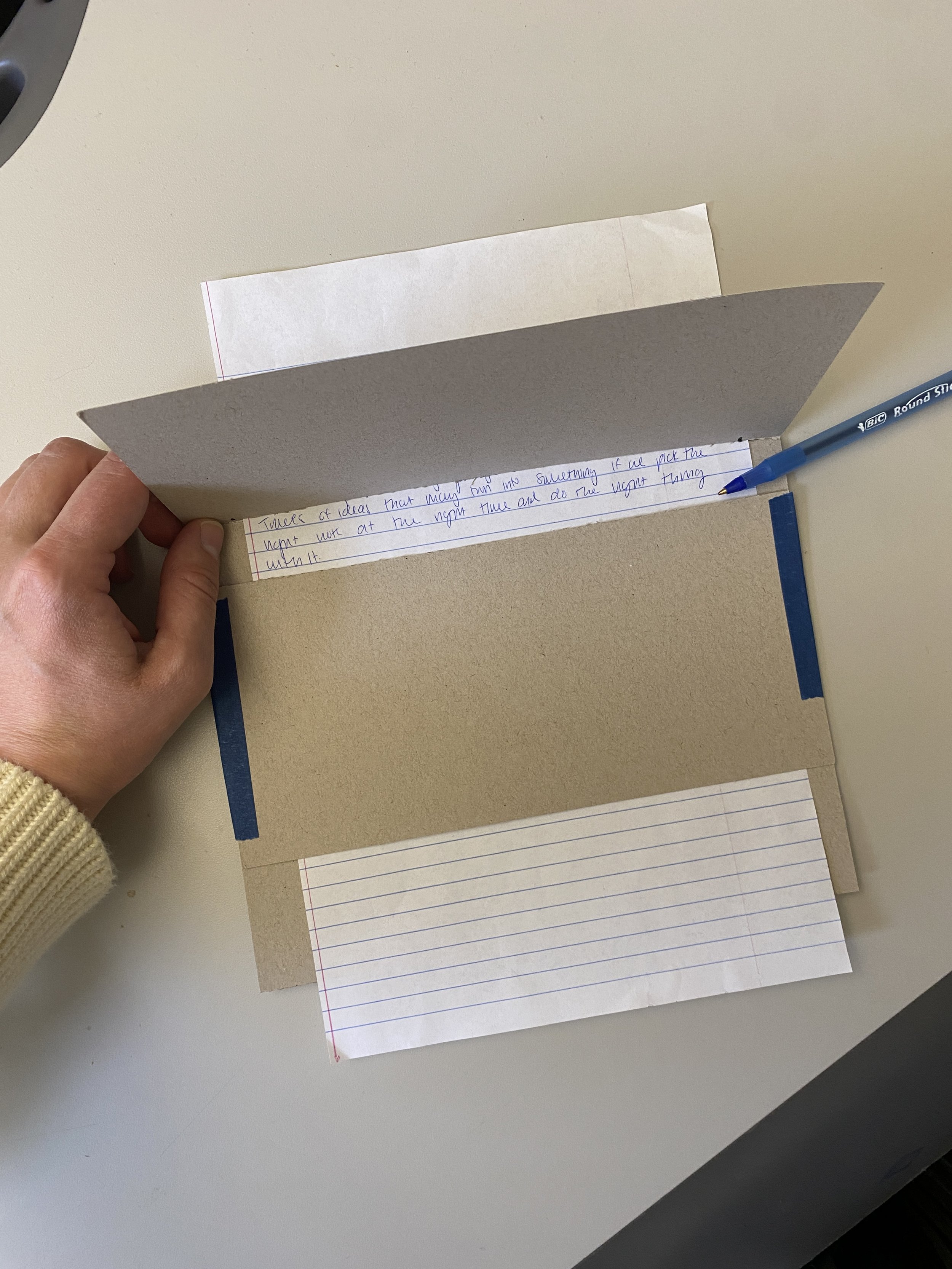
Physical prototype

One of my participant’s drafts in the V0 prototype
The concept resonated with the writers I spoke with
“I found it a little hard at first to not go back and delete and re-write, but then I got into the swing of it. It’s a really interesting aid. I’d like to use it again.”
“It’s trying to prevent [me] from going back and self-editing… which is more like how I try to write myself. It feels like a good exercise.”
“I’m really intrigued… I like that you’re visually blocking some of the information. It literally keeps you from overthinking.”
Sketching a low-distraction space to help writers focus
No ribbon. No distractions.
When people complain about word processors like Microsoft Word, they often complain about the overwhelming ribbon of options they don’t need. drafty strives for the opposite – a stripped down space for people to focus only on getting words on the page.
Early sketches played with hierarchy
This iteration led me to a layout that prioritizes the writing area with large text, negative space, a header with secondary information such as the word count, and a sidebar for customizable settings that my initial user interviewees had asked for.

“It’s like a diner menu with 1,000 mediocre options”
One Reddit user’s take on Microsoft Word


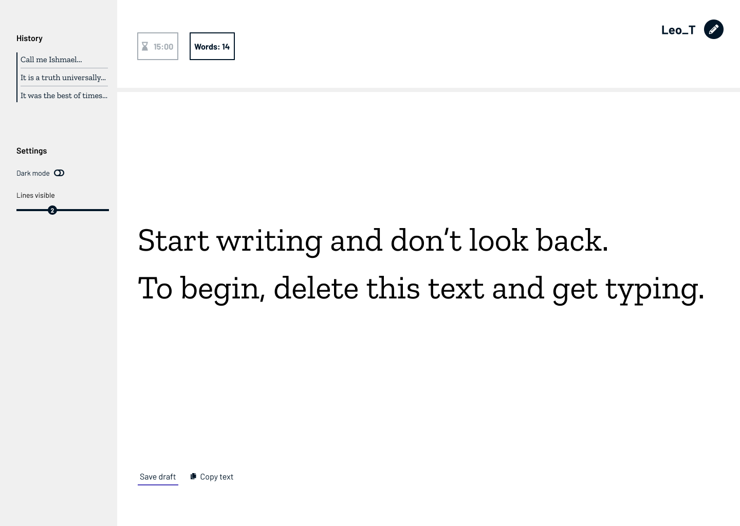
First interactive prototype
How should the draft be obscured?

My first approach was to fade out the text as it scrolled up and off the screen.

I also played with a beam of light that illuminates only most recent lines of text.
This idea was inspired by an E. L. Doctorow’s quote: “Writing is like driving at night in the fog. You can only see as far as your headlights, but you can make the whole trip that way.”
Ultimately, I landed on a concept that brings some drama and delight.
I created a “curtain” that falls over the text after the user starts typing, creating a surprising moment of transition into this new mode of writing.
Allowing for saved drafts within the constraints of vanilla JS
The original drafty design included history pages where writers could access drafts they’d previously saved. However, because drafty is coded in vanilla Javascript, this idea introduced a significant technical constraint: Javascript can’t create new page on the server side.
❌ Solution attempt 1: Create a single history page with anchor links to past drafts
Advantages:
Makes it easy for writers to see how their first drafts evolve as they u
Disadvantages:
Anchor links don’t behave precisely enough. When a short draft sits on top of a long draft, it’s difficult to tell which draft the anchor link points to.
Users reported that viewing all of their drafts in one place was overwhelming.
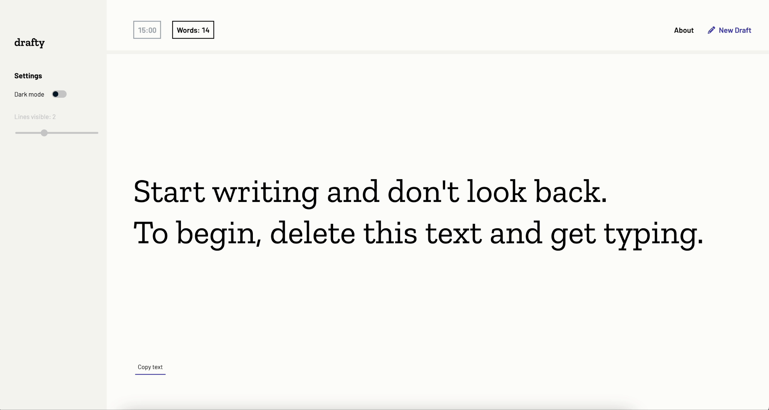
✅ Solution attempt 2: Eliminate history and have only a “copy text” option for writers to bring their draft into their usual word processor
Advantages:
Speaks to the underlying purpose of the site as an aid in getting started – not a replacement for a writer’s entire creative process.
Disadvantages:
While an error prevention protocol helps prevent writers from accidentally losing their work by closing or reloading the browser, they may still lose their work if their browser crashes.


Reflections
They say you should write what you know. In this case, it was design what you know. It’s a truism in my industry that “you are not the user,” which is why I frontloaded research to confirm that this idea resonated with other people — but at the same time, I believe that a designer should let their own experiences and frustrations shape their vision. That’s what brings real feeling and care to our work.
If I were to do it over, I’d start weighing the technical constraints of vanilla JS sooner, so that I had more options to explore regarding draft histories. For future versions of drafty, I hope to speak with users about how they’d like to access their first drafts after producing them and explore frameworks that might allow me to achieve what they need.